The Korean Beauty Show 🎧 Your K-Beauty audio library starts here →
Menu
Blanding in Kbeauty
March 22, 2023

Blanding in Kbeauty
Lauren discusses the issue of blanding in K-Beauty with more brands undergoing complete logo and design transformation in an attempt to modernise. But are they losing their creativity and uniqueness in the process?
CONNECT WITH ME
- My Instagram: www.instagram.com/lauren.kbeauty
- Shop Kbeauty: www.stylestory.com.au
- Style Story’s Instagram: www.instagram.com/stylestory_kbeauty
- Jelly Ko’s Instagram: www.instagram.com/jellyko_official
- Facebook: www.facebook.com/stylestory.au
- Website: www.thekoreanbeautyshow.com
- Sign Up to Our Mailing List to Join Tester's Club: https://stylestory.com.au/pages/free-gift-signup
- Pinterest: https://www.pinterest.com.au/stylestoryau
What is Blanding?
- “If branding is about differentiation, then blanding is the exact opposite.”
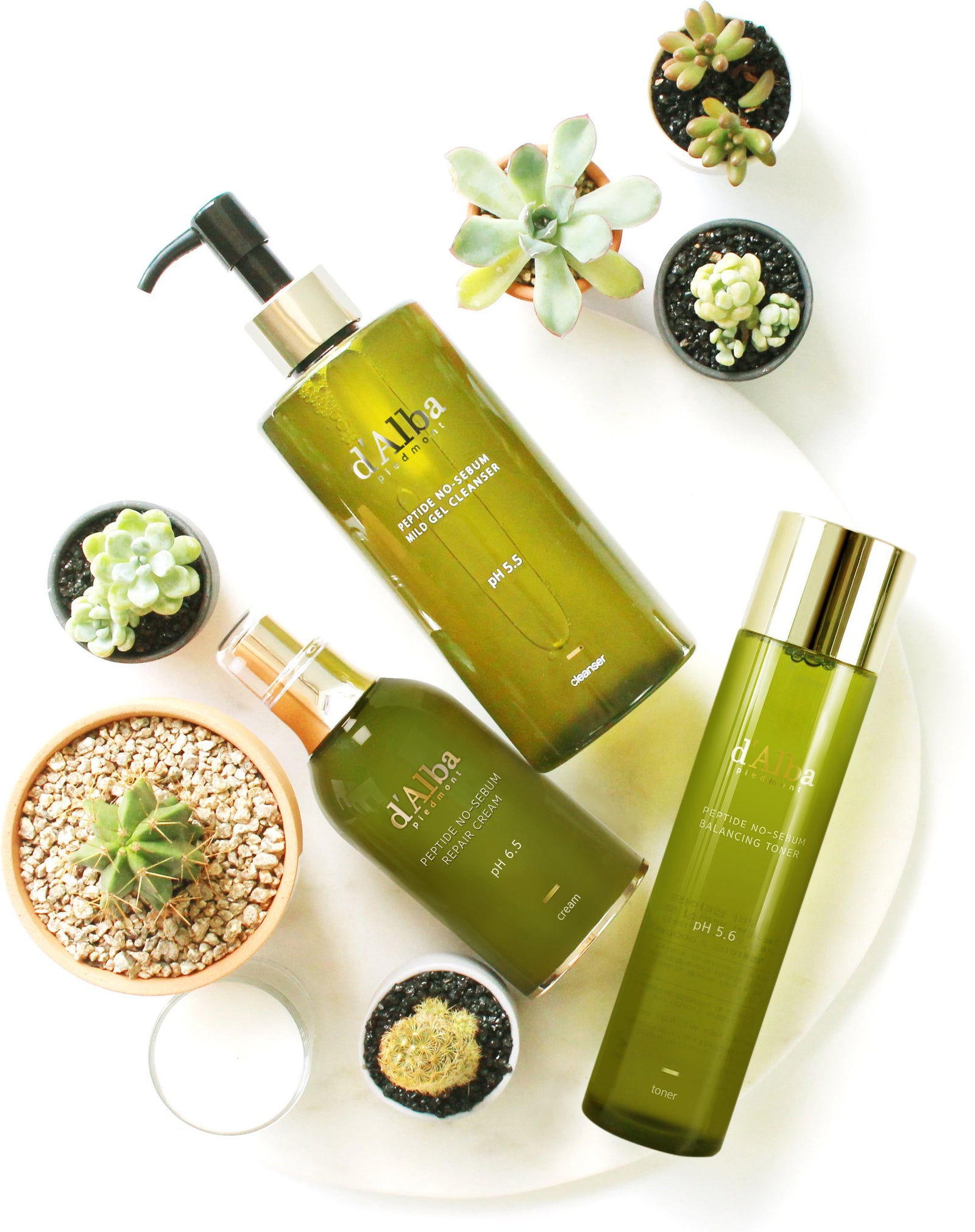
- Recognisable due to the use of modern and simple products and packaging.
- Logos are often written in thin, san serif lines
Why Are K-Beauty Brands Blanding?
- What you like on Instagram fuels the algorithm, which reinforces your preferences with more related content.
- In this kind of environment it makes sense as a branding strategy for brands to try and align with their peers and existing brands.
- You don't want to stand out from the pack because this can be risky.
- It's also a strategy for reaching new audiences on social.
- Minimalist design aesthetic is shorthand for "clean" in K-beauty
- The concept of blanding has a history in fashion as well. The Fashion Law has some great graphics showing the change from brands to blands across the big luxury fashion houses
- Pretty much everything you see trending on apps like Hwahae at the moment - that has a lot to do with this push towards clean, vegan, natural etc
Why Blanding Is Not a Great Idea
- As part of my work I consult with a lot of beauty brand owners, brands looking to manufacture in Korea. Coming up with a brand concept is really important for a lot of them
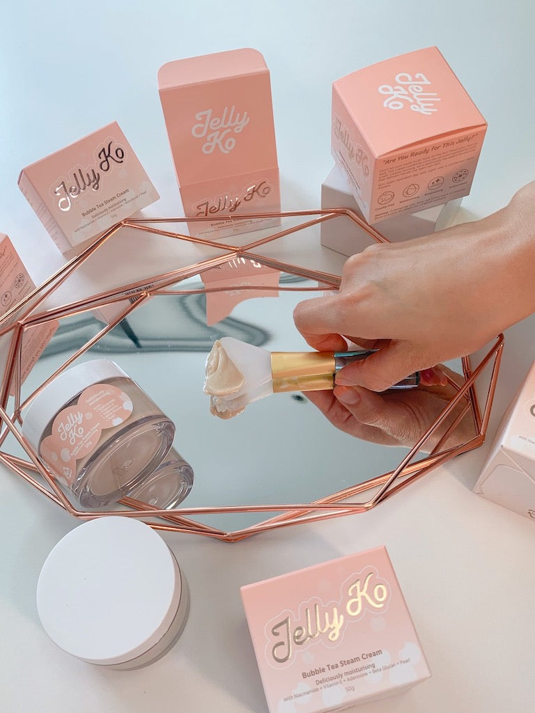
- For my own brand, Jelly Ko, I really wanted to have a very distinct brand identity that represented how we want consumers to feel when they use our products - playful, nostalgic and spoilt

K-Beauty Brands Who Have Had a Modern Makeover
Sulwhasoo
- In 2023, they've changed their logo to reflect the fact that they are pivoting away from China as their main market
- They've dropped the Chinese characters and have modernised and simplified their packaging as well
- Sulwhasoo's parent company, Amore Pacific, also recently announced that they have signed on a new brand model, Tilda Swinton

Innisfree
- Innisfree's original logo really leant into the brand concept of a clean, fresh green space or natural paradise, which was where the name was taken from
- Like Sulwhasoo, they've also undergone a re-branding exercise in 2023 with a new logo and newer, minimalist packaging.
- The reaction to the new branding and image has been lukewarm on social media across both English and Korean speaking media
Etude
- Another Amore Pacific-owned brand that has undergone wholescale change to their brand and concept in recent years
- The brand has changed it's name from Etude House to simply 'Etude'
- Not only have they changed their logo and princess aesthetic but the entire collection looks vastly different than it did in the early 2010s.

Beauty of Joseon
- Had very distinctive packaging and a traditional Korean style logo when teh brand first launched. The Dynasty Cream in particular was covered in 'Hanji', Korean style paper
- Changed that recently to reflect their more global audience
- Obviously hasn’t hurt their business so maybe it was the right move
COSRX
- Half / Half - the newer stuff is very similar to a lot of products on the market
- However, the branding itself was fairly minimal to start with, as the brand really gained traction when the era of mininalism was in full swing
Brands that haven’t blended
Shop Now
"Pretty much everything you see trending on beauty apps like Hwahae at the moment have the same aesthetic. A lot of this has to do with this push towards clean, vegan, natural"
Lauren Lee, Kbeauty Expert
{
"items": [
]
}


Leave a comment
Comments will be approved before showing up.